Case Study · Education
A skill a day, a future redefined.
The Brief
Skill Up with Currie is more than an educational platform - it is a movement. The brief: equip young learners across Ghana with practical, top-tier skill training that builds real confidence, not just certificates.
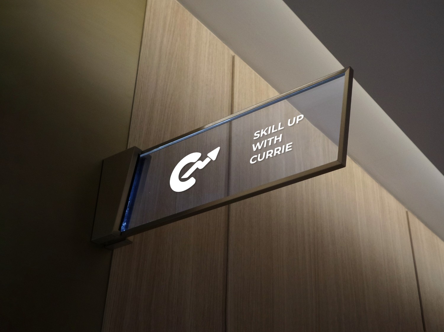
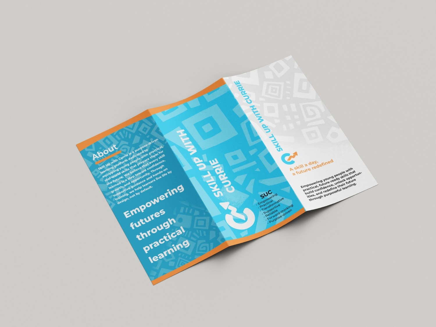
Falcon was brought in to translate that mission into a visual language - a mark of transformation that could carry the brand from favicon to certificate, from splash screen to signage, with the same quiet confidence throughout.
The Mark
A stylised letter C, and an upward zigzag growth arrow - together, a single confident mark of transformation.
01
Stands for Currie - the heart of the brand and the personal guidance every learner receives.
02
Represents the real journey of skill-building - never linear, always upward.
03
Orange for warmth and the spark of inspiration; blue for trust and the calm confidence of mastery.
Colour Palette
Blues anchor the brand in reliability and authority; oranges and gold inject warmth, optimism, and a sense of premium achievement.
#0A2A3A
#3EC1EF
#F28C3A
#C9A227
In Application
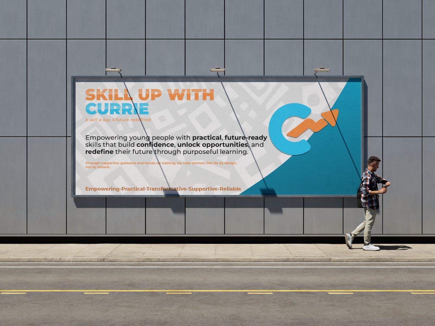
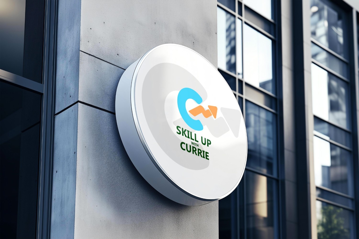
It has been an absolute joy crafting this identity with Skill Up with Currie. From the very first conversation, their vision was clear: to empower young people across Ghana with the practical skills, confidence, and hope they need to redefine their futures - one skill at a time.
Falcon Creative Studio — Crafting brands that inspire