![[background image] image of construction team meeting (for a construction company)](https://cdn.prod.website-files.com/68f9dd4faf55f7abf1af46e1/69015408e8ff1c5dd3c8e41c_FINAL%20LOGO.png)
Case Study
Jeremiah Impact Foundation
Project Overview
The Jeremiah Impact Foundation (JIF) is a non-profit organization dedicated to transforming lives through mentorship, empowerment, and provision. When JIF approached Falcon Creative Studio, the vision was clear — create a timeless symbol that captures the spirit of faith-driven impact while maintaining clarity, trust, and adaptability across platforms.
Our challenge was to build a visual identity that could speak to both community and corporate audiences — one that evokes compassion but commands professionalism. The result is a logo system rooted in symbolism, harmony, and purpose.
The Challenge
Unlike commercial brands, non-profits thrive on emotional trust and relational depth.
For JIF, this meant developing an identity that balances human warmth and structural authority. The mark needed to:
- Convey empowerment and continuity.
- Function effectively across multiple formats — from stationery to social banners and event materials.
We needed a solution that would endure, uplift, and unify — a visual translation of “impacting what seems impossible.”
Our Approach
Falcon’s process began with understanding JIF’s DNA — their mission, audience, and core values of faith, empowerment, provision, and compassion. Through a structured discovery phase, we mapped the emotional language that the brand needed to convey: strength, unity, and care.
From there, we translated these values into geometry, form, and color — every curve, serif, and hue was intentional.
Concept Development
The concept took shape through a monogrammatic approach, merging the initials J, I, and F into a unified symbol enclosed by an oval.
This integration of letters signifies harmony and shared purpose — how mentorship, empowerment, and provision work together to create lasting transformation.
The encircling oval was designed to represent wholeness, protection, and continuity, reflecting JIF’s commitment to nurturing sustainable growth in the lives it touches.
This approach allowed us to create a logo that feels complete, intentional, and forward-facing — one that stands confidently in formal contexts yet remains approachable in community environments.
Typography
Typography played a crucial role in establishing credibility.
We selected Cambria Math, a dignified serif typeface known for its clean geometry and scholarly undertones. It embodies authority, balance, and compassion — qualities central to the foundation’s identity.
Cambria Math also bridges the traditional and the modern — a typeface that feels academic yet empathetic, making it ideal for a foundation rooted in wisdom and empowerment.
Color System
Color became the emotional thread of the identity. The palette — a harmony of purples and mauves — symbolizes wisdom, compassion, and spiritual vision.
ColorHexMeaningDeep Plum#532654Wisdom, Integrity, DepthRoyal Purple#673564Compassion, Faith, Vision: Soft Mauve-#8A4C6F. Warmth, Approachability :White-#FFFFFF. Purity, Hope, Clarity
This blend of rich purples and soft undertones projects both gravitas and empathy. It’s a palette that feels regal yet human — capable of inspiring trust in donors while resonating emotionally with the communities JIF serves.
Logo System & Structure
The final JIF logo system was built for flexibility and integrity, ensuring adaptability across multiple formats without losing identity coherence.
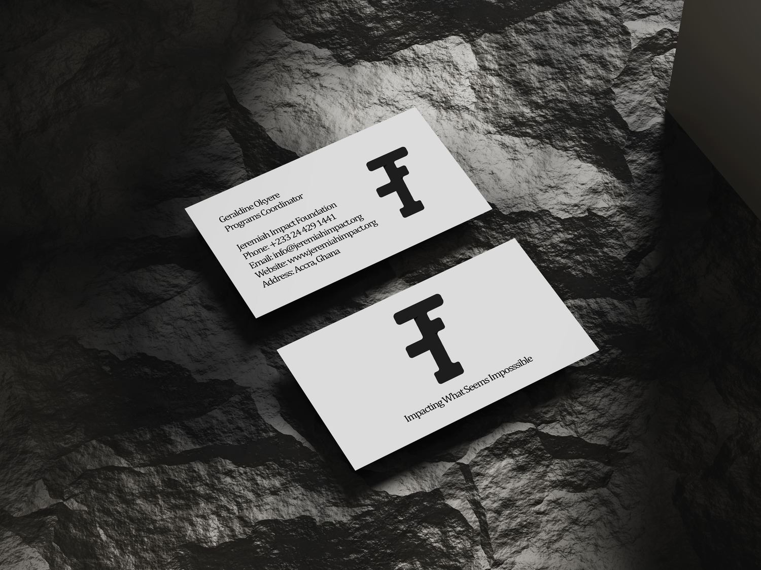
A. Main Logo
- Combines the “JIF” emblem enclosed in a purple oval with the foundation’s full name below.
- Used as the official representation across primary touchpoints (documents, website, stationery).
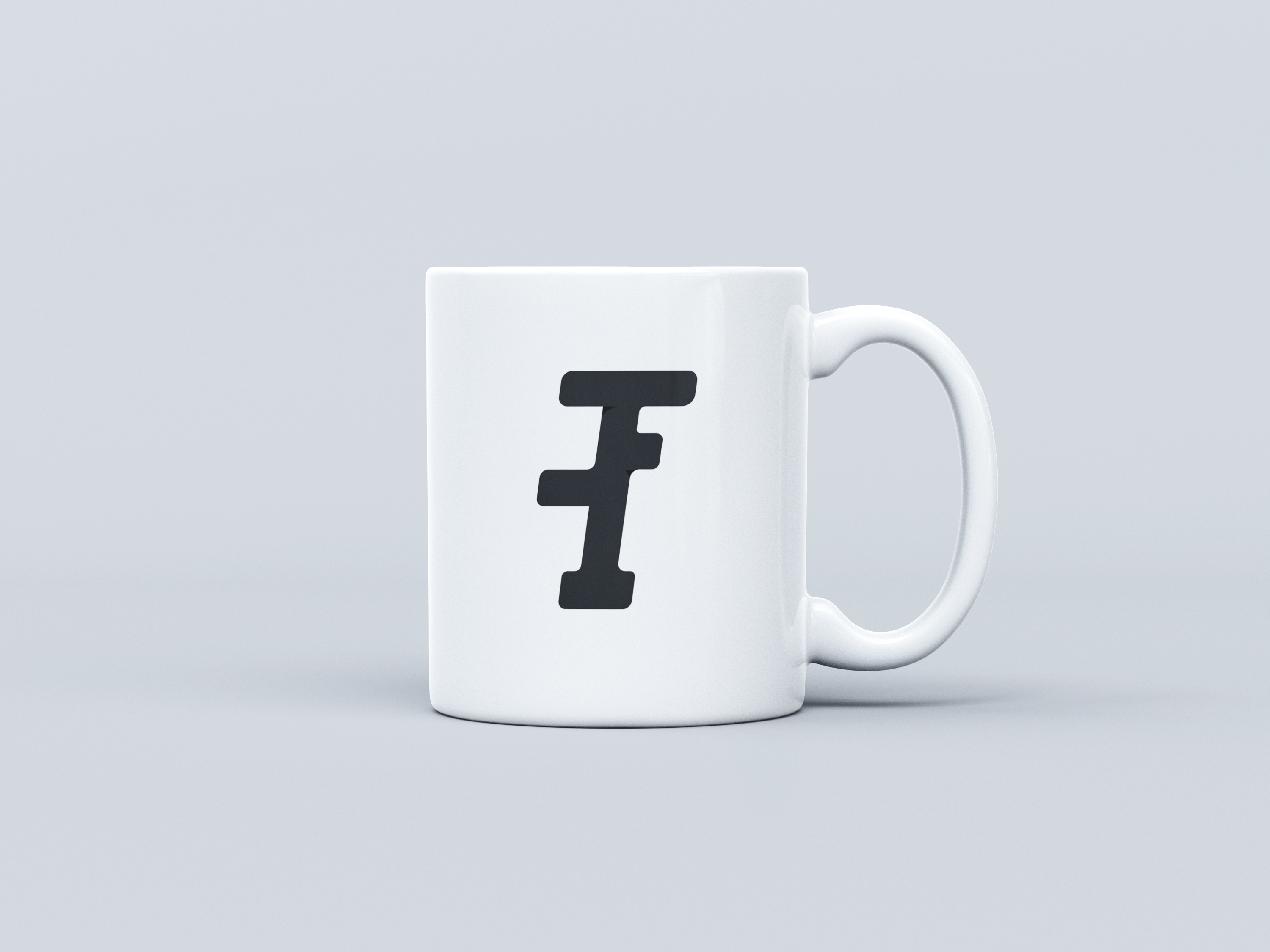
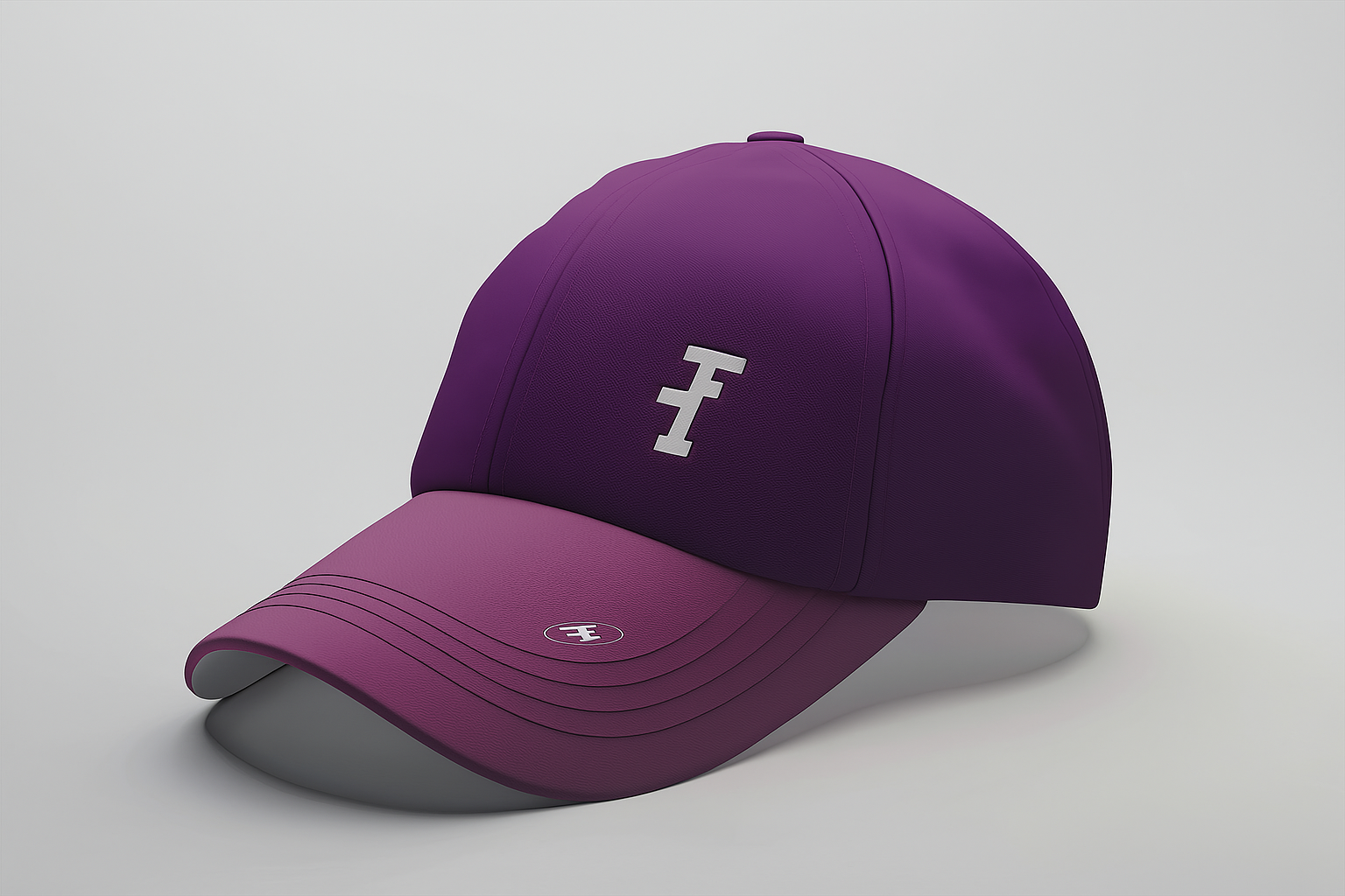
B. Emblem Without Text
- The oval-enclosed emblem only — ideal for merchandise, signage, or areas with text redundancy.
C. Logo Icon
- Black monoline version for formal documents, stamps, and low-color printing.
D. Symbol Mark
- The stand-alone “JIF” initials, stripped of the oval for minimalist digital use (e.g., favicons, social icons).
Each variation was carefully engineered to maintain legibility, balance, and brand consistency regardless of scale or medium.
Design Rationale
The JIF logo is not just a mark — it’s a visual philosophy.
- Monogram integration represents unity and shared purpose.
- Oval containment symbolizes continuity, protection, and completeness.
- Serif typography adds wisdom, intellectual depth, and trust.
- Purple gradient spectrum communicates transformation, faith, and compassion.
Together, they form a system that mirrors the foundation’s mission: empower, nurture, and sustain.
Brand Guidelines & Implementation
Falcon delivered a full brand usage system that defines:
- Color integrity rules, clear-space specifications, and minimum sizes.
- Guidelines for monochrome use, ensuring clarity across print and digital.
- Type hierarchy (Playfair Display and Lora as secondary fonts for communication).
- Improper usage rules, preserving visual coherence and brand professionalism.
We also created visual assets demonstrating how the brand comes to life:
- Official documents and stationery mockups.
- Event banners and shirts featuring the emblem without text.
- Social media profile icons using the stand-alone JIF mark.
- Legal templates with the monochrome version.
Visual Identity in Action
Applications include:
- Letterheads and reports: Conveying trust and professionalism.
- Community programs & banners: Amplifying visibility and recognition.
- Digital campaigns: Consistent presence across social platforms.
- Merchandise: Simplified emblem ensuring quality in embroidery and print.
These consistent applications transform the logo into a recognizable, trusted emblem of impact and transformation.
The Essence of the Brand
Tagline: Impacting What Seems Impossible
Core Values: Faith. Empowerment. Provision. Compassion.
Brand Personality: Visionary, Trustworthy, Inspirational.
The logo is not just a design outcome — it’s a visual ambassador for the foundation’s mission. It tells a story of hope realized through action, and faith translated into measurable change.
Final Impression
The Jeremiah Impact Foundation logo embodies faith in motion — a balance between elegance and empathy, structure and soul.
Through minimalist geometry and symbolic color, the mark captures transformation as both a process and a promise.
It stands as a timeless expression of JIF’s commitment to impact — dignified, refined, and resonant.
Client Impact
Since the rollout of the new identity:
- The visual identity now aligns with the tone of its mission statements and outreach materials.
- The simplicity of the emblem ensures scalability, reducing reprint costs and improving consistency across multiple media.
This project demonstrates how Falcon Creative Studio merges purpose with precision — transforming ideas into enduring visual legacies.
Closing Reflection from Falcon Creative Studio
“Designing for organizations like JIF reminds us why we do what we do — using creativity to serve purpose. The goal was never just to design a logo, but to create a symbol of transformation and compassion that could carry the foundation’s mission into the future.”
— Nhyira Kwayisi-Dokyi Creative Director, Falcon Creative Studio