![[background image] image of construction team meeting (for a construction company)](https://cdn.prod.website-files.com/68f9dd4faf55f7abf1af46e1/6901527a50f8dceff45d74f6_Shopping_Bag_Close-up_50.jpg)
Case Study
OSCL Podcast
Project brief & objectives
Client goal: Build a visual identity that communicates spiritual leadership, mentorship, and reflection — a mark that will work at podcast scale, in merch, and as a digital icon across platforms.
Primary objectives
- Create a readable, iconic logo that reads at small sizes (app icon/podcast thumbnail).
- Evoke wisdom, faith and mentorship in a contemporary way.
- Deliver an extendable brand system and usage guidance for real-world applications (merch, social, print).
- OSCL Document Final
Challenge
Design a symbol that is:
- Immediately legible at tiny scales (podcast thumbnails, app icons).
- Spiritual without feeling dated — bridging tradition (the cross/book) with modern simplicity.
- Flexible for physical production (embroidery, pins) and digital reproduction.
- OSCL Document Final
Research & insight (what informed the creative direction)
- Audience & context analysis — Podcast listeners are primarily mobile-first; thumbnails must compete in visually noisy app UIs. Legibility and a strong silhouette are non-negotiable.
- Symbol study — The cross and book are universal metaphors for faith and learning; placing them in a single, compact mark creates immediate semantic clarity.
- Competitive scan — Many faith-based logos skew either overly ornate or overly generic. Opportunity: craft a mark that is spiritual but restrained and modern.
- Material & production constraints — Apparel, embroidery, and lapel pins require simplified shapes and minimal stroke detail. This drove the decision toward compact, block-friendly forms.
These insights led to the central concept: a compact cross + open-book icon that reads clearly and scales reliably.
OSCL Document Final
Concept development — step by step
1. Discovery & alignment
- Kickoff call & brief validation with stakeholders.
- Agreement on values (wisdom, faith, mentorship, continuity) and brand tone (modern, credible, warm).
- Scope: logo system + usage guide + merch mockups + digital icons.
2. Sketch phase (analog → digital)
- Rapid thumbnail sketches exploring book-armature, cross placement, rounded-square framing (for app icon), and wordmark pairings.
- Prioritize silhouettes that hold when reduced to 16–32px.
- Shortlist 3 concept directions: framed compact mark (app-friendly), free-floating symbol (for print/merch), and wordmark-focused lockup.
3. Digital exploration & refinement
- Vectorize selected sketches in Inkscape/Illustrator.
- Test negative-space solutions (white stroke detail used to improve legibility across tones).
- Tighten proportion between symbol and wordmark (Inter chosen for legibility and geometric clarity).
4. Color & typography testing
- Selected palette: Navy Blue (#0B1D3A) for depth and trust; Warm Taupe (#C5B59F) for warmth and approachability; White for highlights and purity.
- Typeface: Inter for its modern, geometric legibility that complements the structured icon. Color and type choices were validated across digital mockups and print proofs.
5. Iteration with production constraints
- Simplify the mark for embroidery and small-format production: remove fine details that would be lost when stitched.
- Create “framed” (rounded-square) version for app icons and a free-floating minimalist symbol for watermark and pattern use.
6. Finalization & systemization
- Produce primary logo, branding lockup (icon + wordmark), icon-only marks, app icon, and simplified mark for merchandise.
- Create usage rules (clear space, minimum size, background recommendations) and palette / typography specs.
Design rationale — why this solution works
Iconography
- Open book + cross: communicates learning, leadership and faith in a single, compact symbol — easy to read and emotionally resonant.
- Rounded square frame for the primary mark: gives consistent containment for podcast platforms and social avatars where square or rounded thumbnails are standard.
Typography
- Inter: chosen for its modern neutrality and high legibility at small sizes; balances the serif-free geometric system to keep the identity accessible and contemporary.
Color system
- Navy Blue (#0B1D3A): depth, wisdom, and spiritual gravity.
- Warm Taupe (#C5B59F): softens the system, adding approachability and human warmth.
- White accents: emphasize clarity, purity, and highlight the central cross motif. These colors together create a refined, durable palette for both digital and print.
Logo system & usage (summary of the delivered guide)
The delivered OSCL Logo Usage Guide includes:
- Main logo (icon + wordmark within rounded square) — primary for official touchpoints.
- Branding lockup (icon above wordmark) — flexible for print and apparel.
- Icon-only marks (with and without frame) — for favicons, pins, or embroidery.
- Digital app icon (white mark reversed on dark rounded square) — optimized for 16px+ clarity.
- Background and color rules — use on light/neutral backgrounds for max contrast; specify Warm Taupe and Ivory as supportive backgrounds for printed materials.
Applications & deliverables
Delivered assets and mockups included:
- Vector master files (AI / SVG / PDF).
- PNG/JPEG exports at multiple sizes for podcast platforms and social.
- App icon variants optimized for Android/iOS and podcast players.
- Brand usage guide (PDF) with clear-space, minimum-size rules, color codes and typography specs.
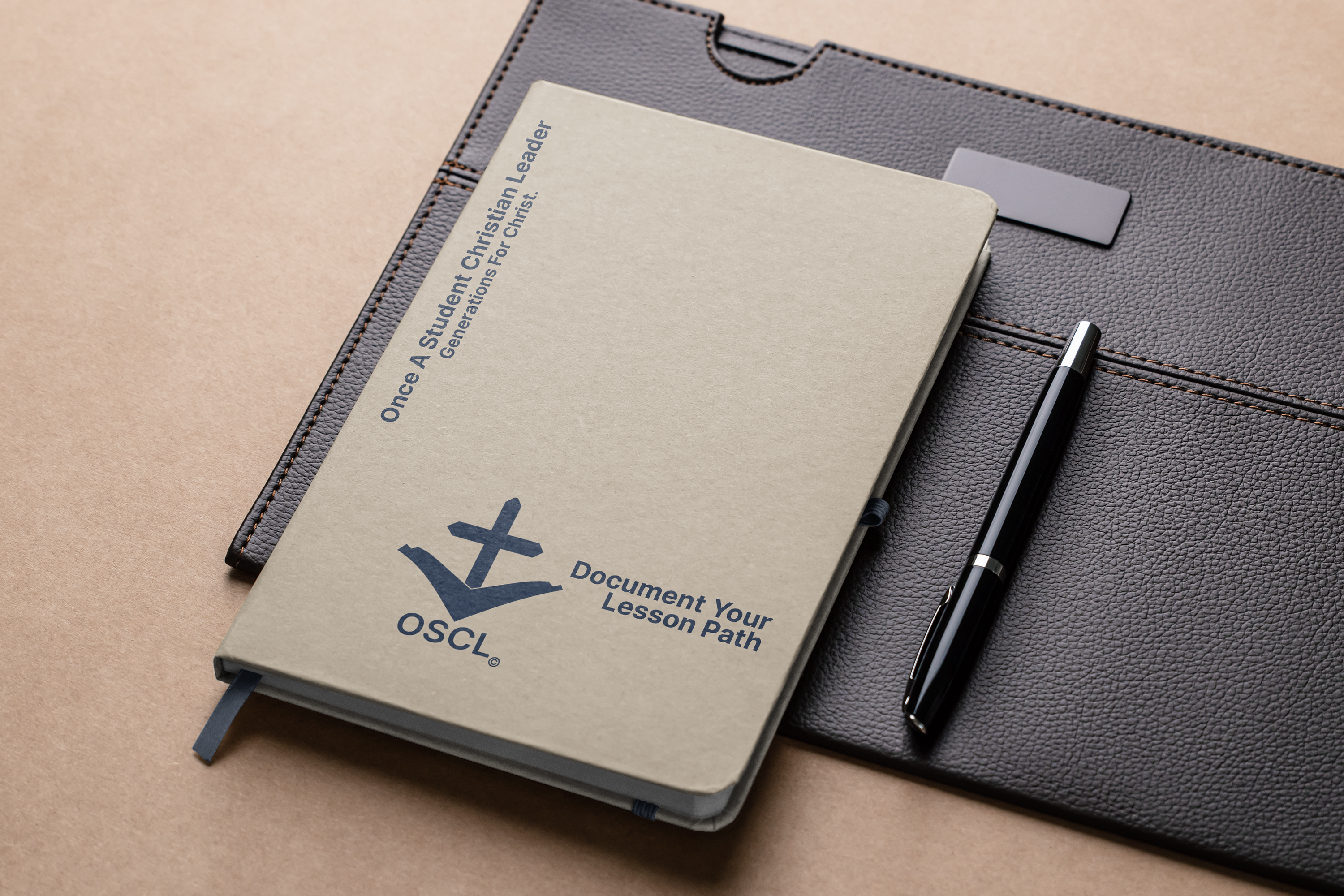
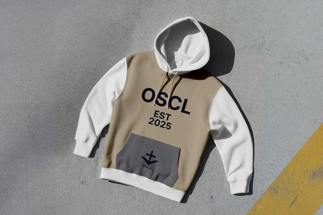
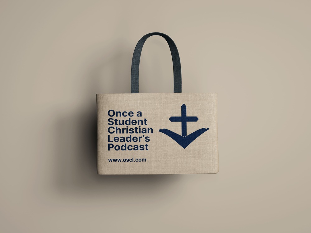
Applied mockups
- Podcast cover art (mockup)
- Social profile avatars and banners
- Apparel & merchandise (T-shirt, tote, lapel pin) mockups showcasing wearable identity
- Embroidery & pin production flats (simplified symbol)
Production considerations & handoff
- Production-ready files: supply of vector and raster exports with safe margins for print and embroidery.
- Embroidery/pin specs: simplified symbol included to ensure clean outcome at small stitch counts; recommended PMS or Pantone conversions provided for manufacturers.
- Digital delivery & documentation: organized folder structure (logo, colour, type, mockups, exports) and the usage PDF to ensure consistent application by the client and third-party vendors.
Clarity of message: OSCL now has a unified visual voice that communicates faith, leadership and continuity in a single mark.
Platform readiness:Icon optimized for podcast platforms and social, ensuring recognizability at small sizes.
Physical production ready: Deliverables included simplified marks for embroidery and pins, enabling consistent merchandise production.